
A customer sends you a logo and says, “I need this exact blue.” On their phone, it looks bright and slightly purple. On your shop monitor, it looks darker. After the DTF transfer is printed and pressed onto a black shirt, it looks different again.
That situation is common because the color has passed through several different environments: an RGB display, design software, RIP software, ink, transfer film, white ink, heat, and fabric. Each stage can affect how the final color appears.
The practical answer is not to chase a perfect screen match. Build a repeatable DTF color matching workflow that lets you compare real printed samples, document the selected color, and use that reference for future orders.
> Quick answer: DTF colors do not always match your screen because screens emit RGB light, while DTF transfers use printed ink on film and fabric. Monitor settings, color profiles, white ink, garment color, printer settings, and heat pressing can all influence the final appearance. A physical color chart printed and pressed through the same workflow gives you a more useful production reference.
Why Do DTF Colors Look Different From Your Screen?
Your monitor and a finished shirt create color in completely different ways.
A phone, tablet, or computer monitor emits red, green, and blue light. The brighter the pixels, the more light reaches your eyes. A pressed DTF transfer does not emit light. It reflects light from printed ink, transfer film, white ink, and the garment underneath.
That difference matters even when the artwork file is prepared correctly.
A typical DTF color passes through this process:
- The artwork begins as RGB values or HEX codes.
- Design software interprets those values.
- RIP software converts the artwork into printable ink instructions.
- The printer lays down color ink and a white underbase.
- The design is printed onto transfer film and cured with adhesive powder.
- A heat press bonds the transfer to the garment.
- The final color is viewed under a particular type of lighting.
Printer ink, film, white-ink density, RIP settings, pressing conditions, and the garment color can all affect the result. This is why a digital preview should be treated as an expectation, not a physical proof.
For a separate troubleshooting resource focused on faded or muted output, see SpeedE Transfers’ guide to why DTF colors look dull. This article focuses on the earlier problem: why the screen preview and pressed transfer can differ even when neither one appears defective.
RGB vs. Printed DTF Colors
RGB is not “bad” for DTF artwork. It is the color model used by displays and many design workflows. The problem is that an RGB value shown on one screen does not guarantee the same physical result when converted to ink.
A HEX code is another way to represent an RGB color. For example, #0066B3 describes a particular digital blue within a defined color space. It does not tell a DTF printer exactly how that blue must appear on every combination of printer, ink, film, RIP software, garment, and heat press.
The W3C sRGB reference explains the role of sRGB as a standard color space for digital content. That standard helps devices interpret color consistently, but it cannot make an illuminated display identical to a reflective textile print.
Several issues can create a screen-to-print difference:
- Display brightness: A bright monitor can make colors look more vivid than the printed version.
- Monitor differences: Two monitors can show the same file with different brightness, contrast, white balance, or saturation.
- Phone display modes: Many phones use vivid or enhanced modes that make colors look more intense.
- Color gamut: Some bright RGB colors are outside the reproducible range of standard DTF ink.
- Profile conversion: A RIP or design application may map an out-of-gamut color to the closest available printed color.
- Viewing light: A blue may look different under daylight, retail LEDs, or warm indoor bulbs.
For standard SpeedE Transfers artwork, follow the current file instructions and avoid converting files repeatedly between unrelated color profiles. The CMYK DTF printing guide provides additional context on how digital artwork becomes printed ink.
Why Black Shirts Can Change the Way DTF Colors Look
DTF printing on black shirts depends heavily on the white-ink underbase.
The printer generally places white ink behind the color layer so the design remains visible over the dark garment. That white foundation helps prevent the shirt from overwhelming the printed colors, but the final appearance can still change because of garment color, fabric texture, ink density, and pressing.
A color selected from a digital mockup may look different on a black shirt because:
- The white underbase may not appear identical to screen white.
- Dark fabric changes the contrast surrounding the design.
- Thick or textured fabric can affect surface reflection.
- A low-opacity element may allow more visual influence from the garment.
- Excessive heat can change the surface finish or garment color.
- Uneven pressure can create differences across the transfer.
For example, a bright blue logo may look clean and luminous on a monitor but deeper or slightly less saturated after pressing onto black fleece. That does not necessarily mean the transfer failed. It means the physical substrate is part of the color result.
What Affects DTF Color Accuracy?
Color output can vary between DTF setups. A chart printed on one printer should not be treated as a guarantee for every other printer or transfer supplier.
Here are the 12 most important factors to control:
- DTF printer: Different printers have different ink delivery, resolution, pass modes, and maintenance requirements.
- DTF inks: Ink chemistry, age, circulation, and color balance can affect saturation and hue.
- Transfer film: Film affects ink holdout, surface appearance, release, and transfer behavior.
- RIP software: RIP settings determine how artwork is separated, converted, and printed.
- ICC or color profiles: Profiles can improve consistency when correctly matched to the equipment and production condition.
- White-ink settings: White density and underbase generation strongly influence brightness on dark garments.
- Print resolution: Pass count and resolution affect edges, gradients, detail, and ink coverage.
- Ink density: More or less ink can change saturation, darkness, and the apparent strength of the color.
- Garment color: Black, navy, heather, and light garments create different visual surroundings.
- Heat-press settings: Temperature, time, pressure, peel timing, and finishing presses affect the finished surface.
- Artwork file: Resolution, transparency, embedded profiles, compression, and color values all matter.
- Monitor or display: Brightness, calibration, display profile, and viewing mode affect the color selected digitally.
Why a Physical DTF Color Chart Can Help
Choosing color from a monitor is fast, but it leaves several variables uncontrolled. The customer may be choosing from a phone with a vivid display. You may be viewing the same file on a monitor with different brightness. Neither screen represents the exact combination of ink, film, white underbase, garment, heat, and lighting used in production.
A physical DTF color chart creates a more practical bridge between digital artwork and a finished shirt.
A physical chart is not a universal guarantee of exact color matching. It is a reference for the printer, ink, film, RIP settings, garment, and pressing workflow used to create it.
SpeedE Transfers’ existing DTF color chart guide covers chart-based color selection in more depth. The workflow below focuses on how to use that kind of reference to move from a screen color to a repeatable production decision.

How to Build a Repeatable DTF Color Matching Workflow
Use the same process for new colors, brand approvals, and repeat orders.
- Create or obtain a DTF color chart.
Use a chart that includes identifiable color references, such as HEX codes or shop-specific codes. - Print it using your normal DTF setup.
Use the printer, ink, film, RIP settings, white-ink settings, and production conditions you normally use. - Press it onto a black shirt.
A black garment gives you a useful reference for how the colors appear over a dark base. Follow the correct transfer and pressing instructions. - Organize the printed samples.
Keep the swatches in a clean grid or another layout that makes individual colors easy to locate. - Show customers the actual printed colors.
Let customers compare their desired color with the pressed samples instead of choosing only from a phone or monitor. - Have the customer choose the closest color.
Explain that the selected swatch is a practical match for your workflow, not a promise of identical screen color. - Record the corresponding HEX code.
Save the selected HEX value alongside the customer name, artwork, garment, and order details. - Use that color in future artwork.
Reuse the approved value for the same customer and keep the original design file rather than rebuilding it from a screenshot. - Keep the printed chart available for repeat orders.
Store it away from sunlight, heat, moisture, and abrasion. Use it when approving future logos, uniforms, or apparel drops.
Consistency matters when the same customer returns months later. If they ask for “the blue from the last order,” a documented swatch and approved file are more useful than memory or a phone screenshot.
How HEX Codes Can Help With DTF Color Matching
A HEX code is a six-character digital reference made from numbers and letters. It represents the red, green, and blue components of a color in a digital color space.
For example, if a customer approves a printed swatch labeled with a HEX code, you can enter that value into future artwork. This gives the design team a repeatable starting point and reduces the chance of choosing a slightly different color by eye.
A HEX code does not guarantee the exact printed result. The output can still change if you switch printers, inks, film, RIP settings, white-ink density, garment colors, or heat-press conditions.
Use HEX codes as documented artwork references, then validate important colors against the physical chart or a pressed proof.
How to Reduce DTF Color-Related Reprints
Use these habits to reduce avoidable color disagreements:
- Do not rely only on a monitor or phone.
- Use a physical printed reference for brand and repeat-order colors.
- Keep production settings consistent.
- Document printer, ink, film, RIP, garment, and pressing details.
- Use the same printer, ink, and film combination when possible.
- Confirm color expectations with the customer before production.
- Keep the physical color reference available to the production team.
- Record customer-approved colors with the artwork and order information.
- Request a test transfer when a color is important to a brand or event.
- Avoid changing several production variables at the same time.
For a small color test or limited run, DTF By The Inch can be useful when you do not need a full gang sheet. Testing one or two placements before a larger production run can reveal how a color behaves on the actual garment.
SpeedE Transfers DTF Color Matching Guide
Once the problem is understood, a prepared chart can make the workflow easier to start.
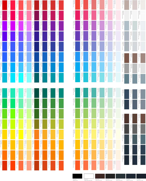
The SpeedE Transfers DTF Color Matching Guide is a downloadable file for DTF printers only. It is based on the color-matching system used at SpeedE Transfers for over three years.
The guide includes:
- 1,080 color boxes
- A clean grid layout
- DTF color swatches
- HEX codes for color selection
- SpeedE Transfers branding
- A layout designed for black shirts
- A digital file ready to print using your own DTF printer
No physical product is shipped. After payment, customers receive access to download the file. They then print the chart using their own DTF printer, press it onto a black shirt, and use the finished samples as a physical DTF color reference.
When a customer selects a swatch, the corresponding HEX code can be used in future artwork. The guide is designed to support a repeatable color-selection process, but it does not guarantee identical results on every printer or production system.
SpeedE Transfers is a family-owned Austin, Texas business operated by Chris and Yuliana Garcia. The company has more than 20 years of printing experience, prints in Texas rather than outsourcing, and uses 6-pass high-resolution printing for its DTF production. It also offers no-minimum ordering, gang sheets starting at $10, qualifying same-day printing for orders placed before 12 PM CST, and Austin local pickup.
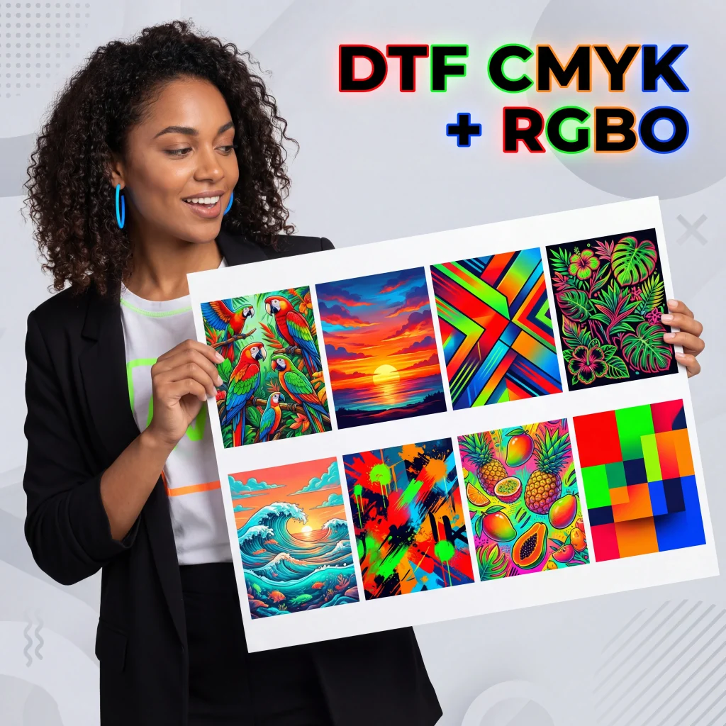
For artwork that needs a wider color range, review the DTF CMYK + RGBO Builder. An extended-color workflow may be useful for certain bright greens, oranges, reds, or detailed gradients, but physical approval is still the safest approach for critical color decisions.
> Want to build your own physical DTF color reference? Get the DTF Color Matching Guide with 1,080 color swatches and HEX references.
DTF Color Matching for Repeat Customers
A physical reference becomes especially valuable when customers reorder the same design.
Common examples include:
- Business logos
- Team apparel
- Company uniforms
- Brand colors
- Repeat T-shirt orders
- Event apparel
- School or organization merchandise
- Seasonal product drops
Suppose a customer orders 30 shirts for an event and returns six months later for another 30. If you kept the approved HEX code, physical swatch, artwork file, garment information, and order details, the next color conversation is much easier.
You can still need a new proof if the printer, ink, film, garment, or production method changes. The reference helps maintain consistency; it does not remove the need to account for changed materials or equipment.
8 Common DTF Color Matching Mistakes
- Trusting the monitor too much: A monitor is a useful design tool, but it is not the same as a pressed garment.
- Choosing colors only from a phone: Phone displays can vary widely in brightness, color mode, and saturation.
- Ignoring the black garment: A color selected on a white mockup may look different after pressing onto black fabric.
- Changing printer settings between orders: Different pass modes, ink density, or white-ink settings can change the output.
- Not keeping a physical reference: Without a chart or approved sample, repeat orders depend too much on memory.
- Not confirming colors with customers: A customer may expect screen color unless you explain the physical approval process.
- Assuming HEX equals exact printed output: HEX creates a repeatable digital reference, but it does not control every physical production variable.
- Changing inks, film, or RIP settings without recalibrating expectations: A new material combination can produce a different color result even with the same artwork.
Frequently Asked Questions About DTF Color Matching
What is DTF color matching?
DTF color matching is the process of comparing a desired color with a printed DTF sample and then documenting the closest repeatable artwork value. It accounts for the printer, inks, film, white underbase, RIP settings, garment, heat press, and viewing conditions instead of relying only on a screen preview.
Why do DTF colors look different from my monitor?
Monitors emit RGB light, while DTF transfers reflect light from printed ink on film and fabric. Display brightness, monitor calibration, phone settings, color gamut, printer profiles, white ink, garment color, pressing, and lighting can all contribute to the difference.
What is a DTF color chart?
A DTF color chart is a group of identified color swatches printed through a specific DTF workflow. When pressed onto a representative garment, it lets a shop or customer compare real printed colors and select a reference for future artwork.
How do you match colors for DTF printing?
Print a color chart with the same equipment and settings used for production, press it onto the intended garment color, and compare the physical swatches with the customer’s target. Record the selected swatch and its HEX code, then use that information for future artwork and approvals.
Can HEX codes be used for DTF printing?
Yes. HEX codes can provide a consistent digital starting point after a customer selects a physical swatch. However, a HEX value alone does not guarantee an identical printed color because output also depends on the printer, ink, film, RIP settings, garment, and heat press.
Why do DTF colors look different on black shirts?
Black shirts change the visual context around the design and make the white-ink underbase especially important. White-ink density, fabric texture, garment color, ink coverage, and heat pressing can all affect how the final colors appear compared with a digital preview.
How can I improve DTF color consistency?
Use a physical chart, keep printer and production settings consistent, document approved colors, prepare clean artwork, use the same garment when possible, and confirm important colors with a pressed sample. Avoid judging brand colors only from a phone or uncalibrated monitor.
What affects DTF color accuracy?
DTF color accuracy can be affected by the printer, ink, transfer film, RIP software, color profiles, white-ink settings, resolution, ink density, garment color, heat-press conditions, artwork file, monitor, and viewing light. These variables can differ between production systems.
Do I need a physical DTF color chart?
You may not need one for casual artwork, but a physical chart is highly useful for clothing brands, print shops, uniforms, repeat orders, and customer approvals. It gives everyone a shared reference based on printed output rather than different screens.
What is a DTF color matching guide?
A DTF color matching guide is a digital file or reference system containing identified color swatches for DTF production. The guide can be printed with a shop’s own DTF printer and pressed onto a garment to create a physical color reference.
Can I use a DTF color chart for customer approvals?
Yes. A customer can compare their desired color with the pressed swatches and select the closest option. Record the selected code and explain that the chart supports consistent selection for that workflow but does not guarantee an exact screen or Pantone match.
Is the SpeedETransfers DTF Color Matching Guide a physical product?
No. The SpeedETransfers DTF Color Matching Guide is a downloadable digital file. After payment, customers receive access to download the file and print it using their own DTF printer.
Build a More Reliable DTF Color Matching Process
Screen color is useful for creating artwork, but a pressed physical sample is more useful for approving production color. By printing a chart through your normal workflow, pressing it onto black fabric, recording the selected HEX code, and keeping the reference for repeat orders, you can reduce guesswork and make customer approvals clearer.
Ready to create a more consistent DTF color-matching workflow? Get the DTF Color Matching Guide with 1,080 color swatches and HEX references.
Follow SpeedE Transfers on Instagram for DTF printing tips, product updates, and apparel production ideas.