

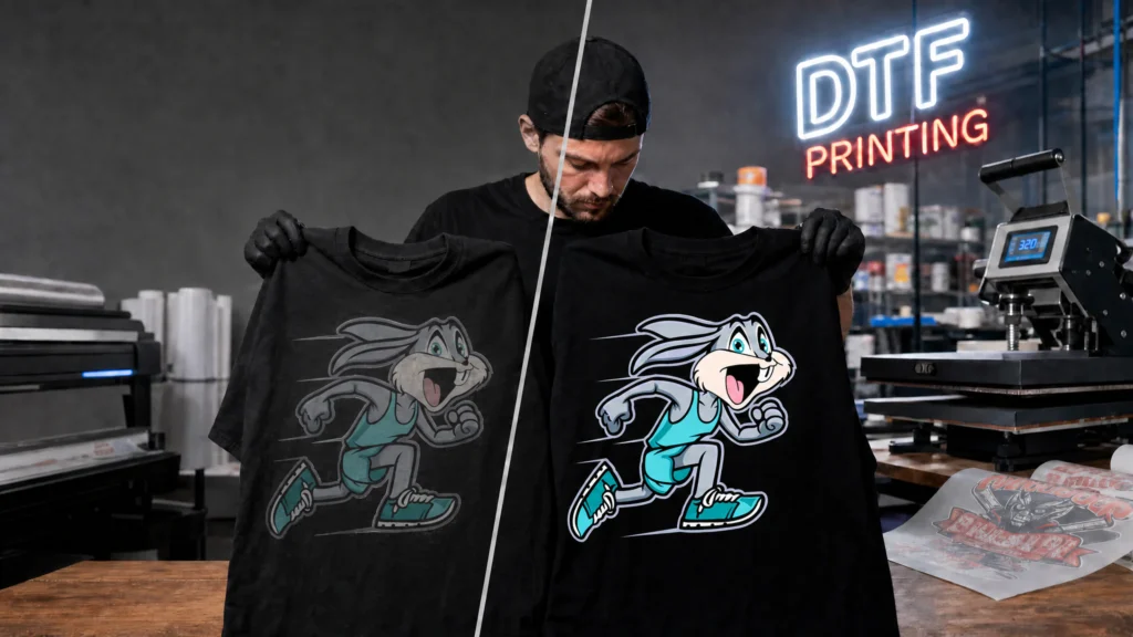
DTF printing can produce bold, clean, full-color designs that look sharp on shirts, hoodies, totes, uniforms, and branded merch. That is why apparel brands, Etsy sellers, print shops, and side-hustle printers rely on it for custom apparel.
But when the colors come out flat, faded, gray, or muddy, it is frustrating.
You expected a bright red. You got tomato soup.
You expected deep black. You got charcoal.
You expected rich full-color artwork. You got something that looks like it sat in the sun for a week.
If you have been searching for why DTF colors look dull, the answer is rarely just one thing. DTF color problems usually come from a mix of artwork setup, printer settings, film quality, white ink coverage, curing, garment choice, heat press settings, and environmental conditions.
Many beginners ask why DTF colors look dull after their first batch of transfers. The truth is that DTF color depends on the full process, not just the printer. A clean design file can still look dull if the white ink is weak. A good transfer can still look faded if the shirt has moisture in it. A bright screen preview can still print differently because RGB colors do not always convert perfectly to ink.
The good news: most dull DTF prints are fixable.
At SpeedE Transfers, we work with custom DTF transfers, gang sheets, apparel brands, print shops, and wholesale transfer customers every day. We see the same DTF printing color problems over and over, and once you understand what causes them, you can prevent wasted shirts, wasted transfers, and unhappy customers.
This guide explains why DTF colors look dull, how to troubleshoot faded transfers, and how to get more vibrant DTF transfers every time.
Why DTF Colors Sometimes Look Faded
DTF colors can look faded for several reasons, but most problems fall into four main categories: artwork, printing, pressing, and garment choice.
| Category | Common Issue | Result |
|---|---|---|
| Artwork | Low resolution, wrong color mode, transparency, poor export | Blurry, muted, or weak color |
| Printing | Weak white ink, poor ink density, cheap supplies | Dull, gray, or washed-out transfers |
| Pressing | Wrong time, temperature, pressure, or over-pressing | Colors shift, flatten, or lose brightness |
| Garment | Moisture, dark fabric, texture, dyes, polyester migration | Reduced vibrancy or color contamination |
One of the main reasons why DTF colors look dull is that people only check one part of the process. They blame the printer, but the problem may be the file. They blame the transfer, but the shirt may be damp. They blame the artwork, but the heat press may be too hot.
A beautiful print starts with clean artwork. Then it needs proper print settings, quality ink, strong white underbase, correct powder adhesion, proper curing, and accurate heat press application.
That is why DTF transfer troubleshooting works best when you look at the full process instead of guessing.
If you are ordering from SpeedE Transfers, start with the DTF artwork requirements guide before uploading your file. A few minutes of file prep can prevent a lot of color problems later.
Most Common DTF Color Problems and Their Causes
| DTF Color Problem | What It Usually Looks Like | Most Likely Cause | How to Fix It |
|---|---|---|---|
| DTF colors faded | Colors look weak before or after pressing | Low ink density, poor artwork, weak white ink, over-pressing | Use 300 DPI artwork, check white underbase, press correctly |
| DTF prints not vibrant | Artwork looks dull compared with screen preview | RGB-to-CMYK shift, low-quality file, cheap film | Use print-ready files and professional transfers |
| Black looks gray | Black areas look smoky or washed out | Weak white ink, wrong black values, fabric interference | Use rich black setup and strong white backing |
| Reds look orange | Red loses depth after printing | RGB color outside printable gamut | Adjust artwork color before printing |
| Neon colors print dull | Bright screen colors look muted | Neon RGB colors cannot fully reproduce in DTF | Use stronger contrast and realistic expectations |
| Edges look blurry | Details lack sharpness | Low-resolution artwork or enlarged file | Upload artwork at final size, 300 DPI |
| Colors change after pressing | Transfer looks good on film but different on shirt | Heat, fabric color, garment dye, pressure | Test press and follow fabric-specific settings |
| White areas look thin | Shirt color shows through | Poor white ink coverage | Use better transfers or correct RIP settings |
| Print feels scorched or flat | Colors lose pop after pressing | Too much heat or time | Lower heat or shorten press time |
| Patchy color | Some areas look uneven | Moisture, poor pressure, uneven platen | Pre-press garment and check pressure |
This table is a starting point. DTF printing color problems are often layered. A slightly low-resolution file plus weak white ink plus too much heat can make the final print look much worse than any one issue alone.
The fastest way to understand why DTF colors look dull is to compare the artwork, the transfer before pressing, and the finished shirt.
7 Reasons Your DTF Transfers Look Washed Out
1. Your Artwork Was Too Low Resolution
Low-resolution artwork is one of the biggest reasons DTF colors faded or blurry prints happen.
A file can look fine on your phone and still print badly at full size. Screens are forgiving. Fabric is not.
If you take a 700-pixel logo and stretch it to 12 inches wide, the printer has to invent missing detail. The result is soft edges, weak gradients, and dull color.
For DTF printing, use artwork at 300 DPI at the final print size whenever possible.
A 10-inch-wide design should be about 3000 pixels wide.
A 12-inch-wide design should be about 3600 pixels wide.
A 14-inch-wide design should be about 4200 pixels wide.
Low-resolution artwork is a common reason why DTF colors look dull, especially when the design was downloaded from social media, copied from a mockup, or enlarged too much.
For cleaner results, check SpeedE Transfers’ artwork consideration page before ordering.
2. Your Colors Were Built for Screens, Not Printing
Screens use RGB. DTF printers use ink.
RGB can show colors that physical inks cannot fully reproduce. Bright blues, electric greens, hot pinks, and neon shades often look stronger on a monitor than they can on fabric.
This is a major reason people search for why DTF colors look dull after receiving transfers. The artwork looked intense on the screen, but the printed version had to fit inside the printable ink range.
Good DTF color correction means adjusting the file before printing, not expecting the printer to match every screen color perfectly.
Another reason why DTF colors look dull is that the design was created for a bright digital screen instead of a real fabric surface.
3. The White Ink Underbase Was Weak
White ink is the hidden support layer behind most vibrant DTF transfers.
On dark garments, the white layer keeps the shirt color from showing through the printed ink. If the white underbase is too thin, the design can look faded, gray, or dirty.
This is especially obvious with:
- Reds on black shirts
- Yellow on navy shirts
- White lettering on dark hoodies
- Bright logos on heather garments
- Pastel colors on dark cotton
A weak white ink layer is a major reason why DTF colors look dull on black shirts, navy hoodies, and dark fleece.
If your reds, yellows, and blues all look muted, why DTF colors look dull may be caused by weak ink density or a weak white ink layer.
4. The Transfer Was Over-Pressed
More heat does not mean better results.
Over-pressing can flatten the ink, dull the finish, affect the adhesive layer, and sometimes cause the garment color to interfere with the transfer.
If the transfer looked bright on film but dull on the shirt, pressing may be why DTF colors look dull after application.
Use the recommended time, temperature, and pressure for your transfer and garment type. Do not add extra seconds just because you want to “make sure it sticks.”
For pressing help, review SpeedE Transfers’ FAQ and pressing instructions.
5. The Garment Had Moisture in It
Cotton, fleece, and blends can hold moisture from storage, shipping, humidity, or a damp room.
That moisture turns into steam during pressing. Steam can interfere with adhesion, soften detail, and make colors look uneven or washed out.
Moisture trapped in the garment is another overlooked reason why DTF colors look dull or patchy after pressing.
Pre-press the garment for a few seconds before applying the transfer. This removes moisture, smooths the surface, and helps the transfer bond more evenly.
A damp hoodie can be why DTF colors look dull, patchy, or cloudy in certain areas.
6. The Film, Powder, or Ink Was Low Quality
Cheap DTF supplies can produce cheap-looking color.
Low-quality film may not release cleanly. Poor powder may not melt evenly. Weak ink can lack saturation. Bad curing can leave the transfer unstable before it ever reaches your heat press.
Cheap film, powder, and ink often explain why DTF colors look dull even when the original artwork file looks clean.
This is one reason supplier choice matters. SpeedE Transfers focuses on premium custom DTF transfers, gang sheets, UV DTF stickers, apparel printing, and wholesale transfer solutions because consistency is what keeps print shops moving.
A professional supplier can help reduce why DTF colors look dull by using better film, ink, powder, and curing controls.
7. The Fabric Color Changed the Final Look
DTF prints sit on top of fabric, but the garment still affects the final appearance.
A bright design on a white shirt will usually look more vivid than the same design on black fleece. A neon-style logo on royal blue polyester may look different than it does on cream cotton. Heather fabric can soften contrast because the base material already has visual texture.
Fabric color is a big reason why DTF colors look dull when the same design looks great on one shirt and weaker on another.
The easiest way to understand why DTF colors look dull is to test one transfer on both a light shirt and a dark shirt.
RGB vs CMYK Explained Simply
RGB and CMYK are two different ways of creating color.
RGB is for screens.
CMYK is for print.
RGB uses light: red, green, and blue. Your phone, laptop, tablet, and monitor all use RGB. Because screens use light, they can make colors look extremely bright.
CMYK uses ink: cyan, magenta, yellow, and black. DTF printers use a print process that converts your digital artwork into printable ink values, usually managed by RIP software.
| Color Mode | Used For | Why It Matters |
|---|---|---|
| RGB | Screens, phones, monitors, digital previews | Looks brighter because it uses light |
| CMYK | Printing, ink output, physical products | More realistic for printed color expectations |
This is one of the most misunderstood DTF artwork settings.
A bright RGB green may look electric on your laptop, but when printed with ink, it may become a more natural green. That does not always mean the printer did something wrong. It may mean the original screen color was outside the printable range.
RGB-to-print conversion is one of the most common explanations for why DTF colors look dull compared with what you saw on your monitor.
For a basic explanation of how RGB and CMYK differ, you can also review Adobe’s guide to color modes.
Low-Resolution Artwork Problems
Low resolution causes more than blur. It also affects color.
When artwork does not contain enough pixel information, color transitions become rough. Gradients band. Small details disappear. Edges become jagged. Fine outlines break apart. Shadows look muddy.
Common low-resolution artwork mistakes include:
- Uploading screenshots
- Using images saved from social media
- Enlarging small logos
- Downloading preview files instead of full-size files
- Exporting from design apps at the wrong size
- Using compressed JPEGs with visible artifacts
- Pulling artwork from old websites or email attachments
If your DTF prints are not vibrant, check the file before blaming the press.
A poor-quality file may be why DTF colors look dull, especially if only one design looks faded while your other designs print correctly.
Zoom into the artwork at 100% on your computer. If it looks fuzzy there, it will not magically sharpen when printed. A printer can reproduce detail, but it cannot create clean detail that does not exist.
For many Etsy sellers, why DTF colors look dull becomes clear after they stop using screenshots and start uploading clean 300 DPI artwork.
Incorrect PNG Export Settings
PNG is one of the best file types for DTF printing, but only when exported correctly.
A bad PNG export can cause dull color, unwanted backgrounds, jagged edges, or semi-transparent pixels that print strangely.
Watch for these PNG mistakes:
- Exporting too small
- Using a colored background by accident
- Saving with semi-transparent edges
- Compressing through messaging apps
- Exporting from Canva at low quality
- Forgetting transparent background settings
- Using screenshots instead of downloads
- Resizing after export
Incorrect PNG export settings can explain why DTF colors look dull even when the design looked sharp in Canva, Photoshop, Illustrator, Procreate, or Affinity.
A poor file export can explain why DTF colors look dull even when the original design looked bright in the design program.
Do not send a screenshot of your design. Do not send a mockup image from a shirt preview. Do not send a flattened file with a white square behind the artwork unless you actually want that white square printed.
For bulk layouts, use SpeedE Transfers’ gang sheet upload page or the custom gang sheet builder.
Poor White Ink Coverage
White ink is one of the biggest keys to vibrant DTF transfers.
Think of white ink like primer before paint. If you paint yellow directly onto a black wall, it looks dull. If you paint yellow over a clean white base, it pops.
DTF works in a similar way. The printer lays color ink and then applies white ink behind the design so it can show clearly on fabric.
Poor white ink coverage can cause:
- Black shirts showing through color
- White text looking gray
- Reds looking brown
- Yellows looking dirty
- Pastels disappearing
- Thin lines losing contrast
- Full-color artwork looking faded
When people ask why DTF colors look dull on dark shirts, weak white ink is one of the first things to check.
A professional DTF print shop controls white ink carefully. Too little white gives dull color. Too much white can create a heavy hand feel or poor detail. The goal is the right balance.
If the print looks weak before pressing, why DTF colors look dull may come down to ink density, white backing, or supplier quality.
Cheap Film and Powder Issues
Film and powder do not get as much attention as ink, but they matter.
DTF film controls how the ink sits, dries, cures, releases, and transfers. Powder creates the adhesive layer that bonds the print to fabric.
Cheap or inconsistent film can lead to:
- Poor ink holdout
- Blurry edges
- Weak release
- Patchy color
- Uneven gloss
- Transfer lifting
- Dull final prints
Cheap powder can cause:
- Rough texture
- Inconsistent adhesion
- Speckling
- Poor stretch
- Uneven melt
- Washed-out appearance after pressing
If every design from a supplier looks weak, film and powder quality may be why DTF colors look dull across multiple orders.
Another reason why DTF colors look dull is that some suppliers lower ink density to save cost, which can weaken the final print.
SpeedE Transfers uses commercial DTF production workflows designed for sharp detail, strong saturation, and reliable pressing.
Wrong Heat Press Settings
Heat press settings can make or break your print.
Too little heat and the adhesive may not bond correctly. Too much heat and the print may lose vibrancy, flatten, scorch, or shift color. Too little pressure can create patchy adhesion. Too much pressure can push texture through the print or distort details.
The correct settings depend on:
- Transfer type
- Garment fabric
- Heat press accuracy
- Pressure level
- Peel type
- Shirt thickness
- Fabric texture
- Production environment
Another overlooked reason why DTF colors look dull is that the heat press may not be reaching the temperature shown on the display.
Many beginners trust the number on the heat press display. That can be risky. Some presses run hotter or cooler than the display says. A heat gun or temperature strips can help check the real platen temperature.
If the print looks good on film but flat on the shirt, why DTF colors look dull is probably connected to pressing or garment choice.
Over-Pressing Transfers
Over-pressing is one of the sneakiest causes of dull DTF prints.
It usually happens because someone wants to “make sure it sticks.” They add a few extra seconds. Then a few more. Then they press again too long after peeling.
The print may adhere, but the color can lose life.
Over-pressing can cause:
- Muted color
- Gloss change
- Flattened texture
- Fabric dye migration
- Scorch marks
- Poor stretch
- Stiff hand feel
- Edges that look too embedded
If you press too long, that may be why DTF colors look dull after the transfer looked vibrant on the film.
Too much pressure can be why DTF colors look dull after pressing.
A short finishing press can help improve feel and durability, especially with parchment or a finishing sheet. But it should be controlled. Do not cook the transfer.
Moisture Problems in Garments
Moisture is easy to overlook because you usually cannot see it.
Shirts stored in a garage, warehouse, basement, humid room, or shipping box can hold moisture. Hoodies and fleece are especially good at trapping it.
When moisture hits heat, it becomes steam. That steam can interfere with the transfer while the adhesive is bonding.
Signs of moisture problems include:
- Patchy color
- Uneven adhesion
- Small bubbles
- Transfer lifting
- Dull or cloudy areas
- Strange marks after pressing
A damp hoodie can be why DTF colors look dull, patchy, or cloudy in certain areas.
The fix is simple: pre-press the garment for 3 to 7 seconds before applying the transfer.
One reason why DTF colors look dull on hoodies is that thick fleece can hold moisture and soften the final print appearance.
Why Blacks Sometimes Look Gray
Black DTF prints can turn gray for several reasons.
The most common cause is weak white underbase. If black ink does not have the right support behind it, it can look smoky instead of rich. Another cause is artwork that is not actually true black.
Some designs use dark gray without the designer realizing it. A black that looks fine on a bright monitor may be RGB 35, 35, 35 instead of 0, 0, 0.
Other causes include:
- Low ink density
- Poor file compression
- Over-pressing
- Fabric texture showing through
- Dye migration from polyester
- Bad curing
- Incorrect color correction
- Low-quality supplier output
If your black artwork prints gray, why DTF colors look dull may come from the black value, the white underbase, or the garment color.
If the black looks gray on the film before pressing, it is likely an artwork or print production issue. If it looks black on film but gray on the shirt, look at heat, pressure, garment color, moisture, and fabric content.
How Fabric Color Affects Vibrancy
Garment color changes how DTF color is perceived.
White, light gray, natural, and pastel garments usually make colors appear brighter. Black, navy, forest green, maroon, charcoal, and other dark fabrics demand stronger white backing and better contrast.
A red logo on a white shirt may look bright and clean. The same red logo on a black hoodie may look deeper and slightly less luminous, even with good white ink.
Fabric texture also matters. A smooth cotton tee gives a cleaner surface than ribbed fabric, heavy fleece, canvas, or textured polyester.
Fabric texture is another reason why DTF colors look dull compared with the digital mockup.
Best garment colors for vibrant DTF transfers often include:
- White
- Ash gray
- Light heather gray
- Natural cotton
- Cream
- Pastel blue
- Pastel pink
- Light tan
- Soft yellow
- Mint
Dark garments can still look excellent with DTF. They just require better artwork contrast and strong professional transfers.
Artwork Transparency Mistakes
Transparency mistakes are a major cause of odd DTF results.
Many design files contain semi-transparent pixels around edges, shadows, glows, distressed textures, or erased backgrounds. On screen, those pixels may look soft and harmless. In DTF printing, they can create unwanted haze, rough edges, weak white ink, or faded areas.
Common transparency problems include:
- Soft eraser edges
- Drop shadows that fade to transparent
- Glow effects
- Anti-aliased text on transparent backgrounds
- Distressed designs with partial opacity
- Background removal tools that leave hidden pixels
- Low-opacity artwork layers
Hidden transparent pixels may be why DTF colors look dull around soft edges, shadows, and faded design areas.
If your artwork has soft shadows, why DTF colors look dull may be tied to semi-transparent pixels that do not print cleanly.
Before uploading, inspect your artwork on both light and dark backgrounds. If you see a haze around the design, clean it up.
Best DPI Settings for DTF
The best DPI setting for DTF printing is usually 300 DPI at the final print size.
That last part matters.
A file that says 300 DPI but is only 2 inches wide will not work well if you enlarge it to 12 inches. DPI only makes sense when paired with physical dimensions.
| Final Print Width | Recommended Pixel Width at 300 DPI |
|---|---|
| 4 inches | 1200 pixels |
| 8 inches | 2400 pixels |
| 10 inches | 3000 pixels |
| 12 inches | 3600 pixels |
| 14 inches | 4200 pixels |
| 16 inches | 4800 pixels |
The wrong DPI setting can be why DTF colors look dull instead of crisp, clean, and professional.
For most DTF artwork settings, 300 DPI is the sweet spot. Higher can be useful for detailed art, but massive files can slow down upload and processing without a visible improvement.
If your design has tiny distressed details, why DTF colors look dull may be caused by low-opacity pixels breaking down during printing.
Why Neon Colors May Print Differently
Neon colors are tricky in DTF.
Your screen can display extremely bright neon green, pink, orange, and yellow because it uses light. Standard DTF ink cannot always reproduce those colors with the same glow.
That does not mean neon-inspired designs are a bad idea. They can still look bold. But you need realistic expectations.
Neon DTF color problems usually happen with:
- Electric green
- Hot pink
- Bright cyan
- Highlighter yellow
- Fluorescent orange
- RGB blue-violet shades
If you want to know why DTF colors look dull on neon artwork, the issue is usually the difference between screen color and printable ink.
When neon colors look weaker than expected, why DTF colors look dull usually comes back to RGB colors that cannot fully reproduce in ink.
To improve neon-style prints:
- Increase contrast around neon colors
- Use dark outlines when helpful
- Avoid relying on glow effects alone
- Test print before selling large batches
- Choose garment colors that support brightness
- Use clean, saturated artwork
- Ask your supplier what range is realistic
Monitor Calibration Problems
Sometimes the transfer is fine. The monitor is lying.
Most people design on screens that are too bright, too cool, too saturated, or set to vivid mode. Phones are especially intense. A design that looks rich on an OLED screen may look less dramatic in physical ink.
Monitor calibration affects how you judge:
- Red intensity
- Skin tones
- Shadow detail
- Black depth
- Pastel softness
- Neon expectations
- Overall contrast
An overly bright monitor can make it harder to understand why DTF colors look dull in real life.
If your product photos look brighter than the finished shirts, why DTF colors look dull may be a lighting and monitor expectation issue.
If you sell apparel professionally, use a consistent design monitor and avoid making color decisions on random devices.
Why Prints Look Different After Pressing
A DTF transfer can look one way on film and another way after pressing.
That is normal to a point.
Before pressing, the transfer sits on a clear film with a certain surface sheen. After pressing, it bonds to fabric. The fabric texture, garment color, heat, pressure, and peel all affect the final appearance.
Colors may look different after pressing because:
- The transfer finish changes
- Heat affects the ink surface
- The shirt color changes perceived contrast
- Fabric texture shows through slightly
- White ink backing interacts with the garment
- Pressure embeds the transfer into fibers
- Moisture or dye affects the print
If the transfer looked bright on film, pressing may be why DTF colors look dull on the garment.
This is why test pressing matters for shops and sellers. Press one sample before producing a large batch. Look at it indoors, outdoors, and under your usual product photography lighting.
A clean test press is one of the fastest ways to find why DTF colors look dull before selling the design to customers.
How to Improve Color Accuracy
Perfect color matching is not always possible with DTF, especially from screen to fabric. But you can get much closer with a disciplined workflow.
Use this checklist:
- Design at final size
- Use 300 DPI artwork
- Export clean PNG files with transparency when needed
- Avoid screenshots and compressed files
- Use realistic RGB colors
- Understand that some RGB colors shift in print
- Keep blacks truly black
- Clean up semi-transparent pixels
- Avoid tiny low-opacity details
- Test press before bulk production
- Follow supplier artwork requirements
- Use a calibrated or consistent monitor
- Order from a professional DTF supplier
The fastest way to find why DTF colors look dull is to review artwork, transfer quality, garment moisture, and heat press settings in order.
For brand colors, keep a printed reference sample. Digital color values are useful, but a pressed sample on the actual garment is more reliable.
The question of why DTF colors look dull is easier to answer when you separate artwork problems from heat press problems.
Best File Types for DTF Printing
The best file type depends on the artwork.
For most custom DTF transfers, high-quality PNG files are the easiest and most common choice. PNG supports transparency and works well for full-color raster artwork.
Vector files are excellent for logos, text, icons, and clean graphics because they can scale without losing quality.
| File Type | Best For | Notes |
|---|---|---|
| PNG | Full-color artwork, transparent backgrounds | Best common option for DTF uploads |
| AI | Vector logos and professional design files | Great if supplier accepts it |
| EPS | Vector artwork | Useful for clean logos |
| SVG | Simple vector graphics | May need conversion depending on supplier |
| Print-ready vector or mixed artwork | Good when exported correctly | |
| PSD | Layered Photoshop files | Useful for editing, not always preferred for upload |
| TIFF | High-quality raster images | Large files, strong detail |
| JPEG | Photos only when high quality | No transparency; compression can hurt quality |
A poor file type or compressed upload may be why DTF colors look dull, especially when the same artwork looked better before it was saved or sent.
Avoid:
- Screenshots
- Low-quality JPEGs
- WebP files from websites
- Social media downloads
- Mockup images
- Files copied from text messages
- Tiny logos pulled from Google Images
For custom DTF transfers, why DTF colors look dull usually has more to do with preparation than with the DTF method itself.
Common Beginner Artwork Mistakes
Beginners usually do not make one giant mistake. They make three or four small ones that add up.
The most common beginner artwork mistakes include:
- Designing too small, then enlarging later
- Using screenshots instead of exported files
- Forgetting transparent backgrounds
- Uploading artwork with a white box
- Using tiny text that will not press cleanly
- Choosing neon colors without understanding print limits
- Adding soft glows that fade poorly
- Using low-opacity distress textures
- Exporting at 72 DPI
- Trusting phone previews
- Not checking artwork at actual print size
- Using mockups as print files
- Ignoring garment color
For many Etsy sellers, why DTF colors look dull becomes clear after they stop using screenshots and start uploading clean 300 DPI artwork.
Good DTF artwork is not just pretty. It is built for the size, fabric, and production method.
If you skip artwork cleanup, that may be why DTF colors look dull on the finished shirt.
Professional Artwork Tips for Better DTF Colors
Professional-looking DTF starts before printing. Here are practical artwork tips that can improve color and clarity.
Use Strong Contrast
Contrast makes prints easier to read. If your design uses dark red on black, navy on charcoal, or pale yellow on white, it may look weak even if the print quality is good.
Poor contrast is often why DTF colors look dull even when the transfer itself was printed correctly.
Keep Small Text Simple
Tiny script fonts, thin lines, and distressed lettering can break down in DTF if they are too small.
When small text looks faded, why DTF colors look dull may be tied to thin strokes, weak contrast, or low-resolution artwork.
Clean Your Edges
Zoom in and inspect the artwork. Remove stray pixels, rough cutout edges, and leftover background haze.
Messy edges print as messy edges.
Avoid Unnecessary Transparency
Soft shadows and glows can look nice on screen but print unpredictably. If the effect is important, test it first.
Build for the Shirt Color
A design for a white shirt may need changes before it works on a black hoodie.
For dark apparel, why DTF colors look dull often comes down to whether the white ink layer is strong enough to block the fabric color.
Use Realistic Color Targets
If your artwork uses electric RGB colors, expect some shift. Adjust the design with print in mind.
Save a Master File
Keep your editable source file. Export copies for printing. That way you can fix problems without rebuilding everything from scratch.
The more you understand why DTF colors look dull, the easier it becomes to choose better files, better garments, and better transfers.
How Professional Print Shops Maintain Vibrant Prints
Professional print shops do not rely on luck. They build repeatable systems.
A good shop controls:
- Artwork review
- File resolution
- Color workflow
- RIP settings
- Ink maintenance
- White ink circulation
- Film quality
- Powder application
- Curing temperature
- Humidity
- Storage
- Pressing instructions
- Test prints
- Customer communication
Print shops that understand why DTF colors look dull can train staff to check files, garments, and press settings before production.
White ink is especially important. DTF white ink needs proper maintenance because it can settle, clog, or print inconsistently if the system is neglected.
Professional shops also watch curing closely. Undercured transfers can feel unstable and press poorly. Overcured transfers can lose stretch, adhesion, or color quality.
For wholesale DTF transfer customers, consistency matters even more. A print shop cannot build a reliable business if every batch looks different. SpeedE Transfers supports shops with wholesale DTF transfers.
Best Garment Colors for Vibrant DTF Transfers
DTF can work on many garment colors, but some make color look brighter than others.
| Garment Color | Why It Works |
|---|---|
| White | Maximum brightness and contrast |
| Light gray | Soft base with strong color visibility |
| Natural | Great for vintage and boutique designs |
| Cream | Warm base, good for earthy designs |
| Pastel colors | Supports bright artwork without harsh contrast |
| Ash | Clean base for bold graphics |
| Light pink | Works well with fashion and boutique designs |
| Sky blue | Good for playful designs and logos |
If you are comparing shirts and wondering why DTF colors look dull on one garment but not another, garment color is probably part of the answer.
Dark garments can look amazing too, especially with strong artwork and quality transfers. Black shirts are popular for a reason. But dark fabric needs a stronger white underbase and smart color choices.
For light apparel, why DTF colors look dull is more often caused by low-resolution artwork, weak ink, or over-pressing.
Why Some Suppliers Produce Dull Transfers
Not all DTF transfers are equal.
Some suppliers focus on low price and speed while cutting corners on materials, maintenance, curing, or quality control. That can lead to dull transfers, weak adhesion, inconsistent color, and poor stretch.
Dull supplier output may come from:
- Low-cost ink
- Poor film quality
- Weak white ink settings
- Inconsistent powder
- Bad curing
- Poor printer maintenance
- Rushed production
- No artwork review
- Incorrect color profiles
- Old or clogged printheads
- Humidity problems in the shop
A low-quality supplier may be why DTF colors look dull across multiple orders, even when your artwork is prepared correctly.
If two suppliers print the same file differently, why DTF colors look dull may come down to equipment, ink, film, powder, and curing quality.
SpeedE Transfers specializes in premium custom DTF transfers, gang sheets, UV DTF stickers, apparel printing, and wholesale transfer solutions with fast nationwide shipping. The goal is simple: transfers that press cleanly, look sharp, and help you send out work you are proud to sell.
Importance of Proper Curing
Curing is the stage where the powdered transfer is heated before it is applied to a garment. This melts and sets the adhesive powder so the transfer can bond later during heat pressing.
Poor curing can cause several DTF printing color problems.
Undercured transfers may show:
- Weak adhesion
- Powdery feel
- Patchy color
- Poor wash durability
- Lifting edges
- Inconsistent finish
Overcured transfers may show:
- Dull color
- Reduced stretch
- Hard hand feel
- Adhesion issues
- Cracking risk
Poor curing can be why DTF colors look dull, stiff, or inconsistent.
One reason why DTF colors look dull after washing is that the transfer may have been under-pressed, over-pressed, or poorly cured.
Curing is not just “heat it until it looks done.” Professional shops control time, temperature, airflow, and consistency.
Humidity and Environmental Effects on DTF Prints
Humidity affects DTF printing more than beginners expect.
Too much humidity can affect film handling, powder behavior, ink drying, curing, garment moisture, and pressing. Too little humidity can also create static and handling issues.
Common humidity-related problems include:
- Powder clumping
- Uneven powder coverage
- Moist garments
- Film handling issues
- Ink drying inconsistently
- Adhesion problems
- Cloudy or patchy areas
- Transfer lifting
Humidity in your shop can be why DTF colors look dull during certain seasons.
If the print looks cloudy in random spots, why DTF colors look dull may be caused by moisture trapped in the garment.
If you run a print shop, control your environment as much as possible. Store film, powder, and transfers properly. Keep garments dry. Avoid pressing in a damp room.
If you are an Etsy seller or small apparel brand pressing at home, do not store shirts in a humid garage and then press them immediately. Bring them inside, let them acclimate, and pre-press before applying the transfer.
How to Get More Vibrant DTF Prints Every Time
If you want more vibrant DTF prints, treat the process like a system.
Start With Better Artwork
Use 300 DPI artwork at final size. Keep edges clean. Avoid screenshots. Use strong contrast. Export properly.
This solves a huge percentage of dull color complaints.
Use the Right File Format
For most customers, a transparent PNG is the easiest choice. For logos and clean graphics, vector files are even better when accepted.
Choose Better Color Combinations
Some colors naturally print stronger than others.
Best colors for DTF printing often include:
- True black
- Bright white
- Strong red
- Royal blue
- Golden yellow
- Medium green
- Hot pink-inspired tones
- High-contrast color pairs
If your reds, yellows, and blues all look muted, why DTF colors look dull may be caused by weak ink density or a weak white ink layer.
Pick the Right Garment
A smooth cotton shirt usually gives a cleaner result than rough fleece. Light garments make colors look brighter. Dark garments need strong white backing and good contrast.
Pre-Press Every Garment
Remove moisture and wrinkles before applying the transfer.
This takes seconds and improves consistency.
Follow Correct Pressing Settings
Use recommended temperature, time, and pressure. Do not guess. Do not over-press.
Test Before Bulk Production
If you are selling a new design, press one sample first. Wash it. Photograph it. Check it under normal light.
Testing one shirt first helps you learn why DTF colors look dull before ruining a full batch.
Use Premium Transfers
Better supplies and better production create better prints. Ordering from SpeedE Transfers helps remove a lot of variables because the transfer itself is professionally produced.
SpeedE Transfers helps reduce the guesswork behind why DTF colors look dull by producing premium custom DTF transfers with sharp detail and strong color.
For bulk designs, use the SpeedE Transfers gang sheet upload page or the custom gang sheet builder.
DTF Transfer Troubleshooting: A Practical Workflow
When a customer says, “My print looks dull,” do not guess. Work through the problem in order.
Step 1: Check the Artwork
Ask:
- Is the file 300 DPI at final size?
- Is it a screenshot?
- Are there transparent pixels?
- Are the colors realistic for print?
- Is the black actually black?
- Was the design exported correctly?
Before blaming the transfer, check why DTF colors look dull by reviewing image size, DPI, export settings, and transparency.
Step 2: Check the Transfer Before Pressing
Look at the transfer on film.
If it already looks dull, the issue is likely artwork, print settings, white ink, ink quality, or supplier production.
Before blaming the shirt, check why DTF colors look dull by looking at the transfer before it ever touches the garment.
Step 3: Check the Garment
Ask:
- Is the shirt damp?
- Is it dark, textured, or heathered?
- Is it polyester?
- Is dye migration possible?
- Was it pre-pressed?
Step 4: Check the Heat Press
Ask:
- Is the temperature accurate?
- Is the pressure even?
- Was the press time correct?
- Was the transfer over-pressed?
- Was the peel done correctly?
Step 5: Compare With a Test Shirt
Press the same transfer on a white cotton shirt. This tells you a lot.
If it looks vibrant on white cotton but dull on a dark hoodie, the issue is not simply the transfer. It may be garment color, texture, moisture, or pressing.
The best answer to why DTF colors look dull is usually found by checking each step instead of changing everything at once.
Why DTF Colors Look Dull on Dark Shirts
Dark shirts are the real test of DTF quality.
The darker the fabric, the more the print relies on white ink coverage and contrast. Without a strong white underbase, the shirt color can visually contaminate the print.
Common dark shirt problems include:
- White ink too thin
- Artwork lacks contrast
- Fine details disappear
- Semi-transparent pixels look smoky
- Heat press pressure is uneven
- Fleece texture affects smoothness
- Black ink lacks separation from shirt
If colors look muddy on black shirts, why DTF colors look dull is often connected to poor contrast and weak white backing.
To make DTF prints brighter on dark shirts:
- Use bold artwork
- Add outlines when needed
- Avoid low-opacity shadows
- Use strong white elements
- Choose professional transfers
- Pre-press the garment
- Follow correct heat settings
- Avoid over-pressing
- Test on the exact shirt color
Dark garments can produce beautiful results. They simply leave less room for weak files or cheap transfers.
For dark apparel, why DTF colors look dull often comes down to whether the white ink layer is strong enough to block the fabric color.
Why DTF Prints Are Not Vibrant Even With Good Artwork
Sometimes the file is not the problem.
If you know your artwork is high-resolution, properly exported, and designed well, dull prints may come from production or pressing.
Possible causes include:
- Weak ink density
- Poor white ink layer
- Clogged printhead
- Incorrect RIP profile
- Cheap film
- Uneven powder
- Poor curing
- Old supplies
- Wrong heat press settings
- Moist garment
- Supplier inconsistency
If every design looks faded, why DTF colors look dull may be related to the printer, film, powder, curing, or heat press.
If only one design looks faded, why DTF colors look dull is probably related to that artwork file.
If you order from a supplier and the transfers look dull before pressing, contact them with photos. Include the original artwork, a photo of the transfer on film, and a photo after pressing.
When you know why DTF colors look dull, you can fix faded prints without guessing or wasting more blanks.
Internal Linking Opportunities for This Blog
Use these internal links naturally throughout the published article:
| Link Type | Anchor Text | URL |
|---|---|---|
| Gang sheet page | Upload SpeedE Transfers Gang Sheet | https://speedetransfers.com/product/upload-my-own-gang-sheet-2/ |
| Gang sheet builder | Custom Gang Sheet Builder | https://speedetransfers.com/product/speed-etransfers-gang-sheet-builder/ |
| DTF artwork requirements | DTF Artwork Requirements 300 DPI Guide | https://speedetransfers.com/dtf-artwork-requirements-300-dpi-guide/ |
| Artwork requirements page | Artwork Consideration | https://speedetransfers.com/artwork-consideration/ |
| Custom DTF transfers | Order DTF Transfers Online | https://speedetransfers.com/order-dtf-transfers-online/ |
| Heat press guidance | FAQs and Pressing Instructions | https://speedetransfers.com/faqs/ |
| Wholesale DTF transfers | Wholesale DTF Transfers in Texas | https://speedetransfers.com/wholesale-dtf-transfers-in-texas-for-print-shops-and-brands/ |
Final Checklist Before Ordering DTF Transfers
Before you upload artwork or place a bulk order, run through this checklist:
- Artwork is 300 DPI at final print size
- File is not a screenshot
- PNG background is transparent if needed
- No unwanted white box behind the design
- Edges are clean
- Blacks are truly black
- Neon colors have realistic expectations
- Tiny text is thick enough to print
- Garment color has enough contrast
- Design has been checked on light and dark backgrounds
- File was exported at full quality
- You reviewed supplier artwork requirements
- You know the correct heat press settings
- Garments will be pre-pressed
- You have tested before bulk production
Knowing why DTF colors look dull helps print shops avoid reprints, wasted garments, and unhappy customers.
This is how you prevent most DTF colors faded complaints before they happen.
Order Premium Custom DTF Transfers From SpeedE Transfers
If you want vibrant DTF transfers without fighting dull color, weak detail, and inconsistent results, start with a professional transfer supplier.
SpeedE Transfers produces premium custom DTF transfers, gang sheets, UV DTF stickers, apparel printing, and wholesale transfer solutions with fast nationwide shipping. You can upload your own artwork, build gang sheets, order custom transfers, and get production-quality prints made for real apparel businesses.
A reliable supplier like SpeedE Transfers can help prevent why DTF colors look dull by keeping production quality consistent.
Order premium custom DTF transfers from SpeedE Transfers for vibrant colors, sharp detail, and professional-quality results every time.
FAQs
Why do my DTF transfers look faded?
DTF transfers usually look faded because of low-resolution artwork, weak white ink coverage, incorrect color setup, poor-quality film or ink, wrong heat press settings, moisture in the garment, or over-pressing. If you are trying to figure out why DTF colors look dull, start by checking whether the transfer looks faded before pressing or only after it is applied to the shirt.
Why are my black DTF prints turning gray?
Black DTF prints can turn gray when the artwork uses dark gray instead of true black, the white underbase is too weak, the transfer is over-pressed, or the garment color and texture reduce contrast. Black prints are one of the clearest examples of why DTF colors look dull when artwork values and white ink coverage are not right.
Does RGB or CMYK work better for DTF?
RGB is common for artwork uploads because many RIP systems handle the print conversion, but DTF printing ultimately uses ink output similar to CMYK. RGB colors can look brighter on screen than they can in print. That screen-to-print difference is a major reason why DTF colors look dull compared with digital previews.
What resolution should DTF artwork be?
DTF artwork should usually be 300 DPI at the final print size. A 12-inch-wide design should be about 3600 pixels wide. Low resolution is a common reason why DTF colors look dull, blurry, or less professional than expected.
Why do my colors change after pressing?
Colors can change after pressing because the transfer bonds to fabric, heat affects the finish, garment color changes perceived contrast, moisture interferes with adhesion, or the transfer is pressed too long. If the transfer looked bright on film, the pressing step may explain why DTF colors look dull on the finished garment.
Can cheap film affect DTF print quality?
Yes. Cheap DTF film can affect ink holdout, release, edge sharpness, color consistency, and final vibrancy. Low-quality powder and ink can also make transfers look dull or uneven. Cheap materials are often why DTF colors look dull even when the artwork file is fine.
How do I make DTF transfers brighter?
Use 300 DPI artwork, export clean PNG files, avoid screenshots, improve contrast, remove unwanted transparency, choose garment colors wisely, pre-press garments, follow proper heat settings, avoid over-pressing, and order from a quality supplier like SpeedE Transfers. Once you understand why DTF colors look dull, getting brighter transfers becomes much more repeatable.
Why do DTF colors look dull on dark shirts?
DTF colors look dull on dark shirts when the white underbase is too thin, the artwork lacks contrast, semi-transparent pixels let the shirt color show through, or pressing settings are off. Dark garments need strong white ink coverage and artwork designed with the shirt color in mind. That is the simplest answer to why DTF colors look dull on black, navy, charcoal, and other dark apparel.