
 1")
 2")
Color matching guide (dtf transfer or print Only)
$10.00
NOTE: This is the SpeedETransfers Color Matching Guide for DTF printers only. Get accurate and consistent color results with the same proven system we’ve used at SpeedETransfers for over 3 years.
The file is designed for black shirts and includes 1080 color boxes arranged in a clean grid layout to help eliminate color mismatches and unnecessary reprints.
✅ What’s Included:
– A high-resolution file (ready to use)
– 1080 DTF color swatches in an easy-to-use format
– Updated with SpeedETransfers branding only
– Clean layout designed for easy cutting and use
🖨️ How It Works:
Open the file, print it using your DTF printer, and press it onto a black shirt. Let your customers view and choose their color from real-printed samples.
Then, simply use the hex code in their design for accurate color matching.
Description
Additional information
| Type(Download, Print only) | Downloadable, Print |
|---|
Only logged in customers who have purchased this product may leave a review.
Related products
-

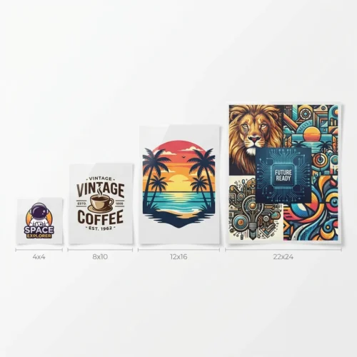
Image By Size
Price range: $0.01 through $11.44 Select options This product has multiple variants. The options may be chosen on the product page -
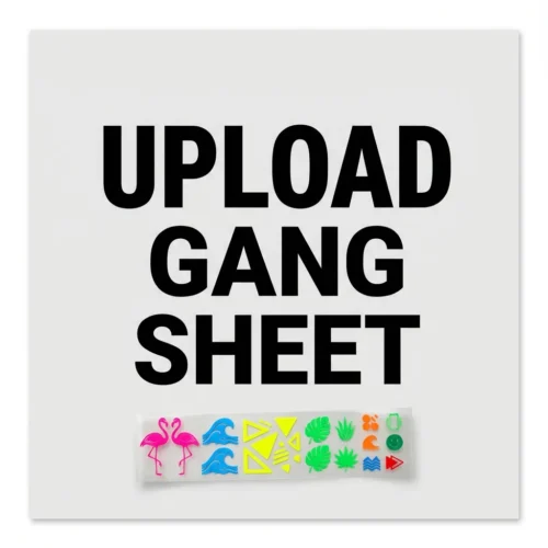
Upload Your Own Gang Sheet
Price range: $10.00 through $165.00 Select options This product has multiple variants. The options may be chosen on the product page -
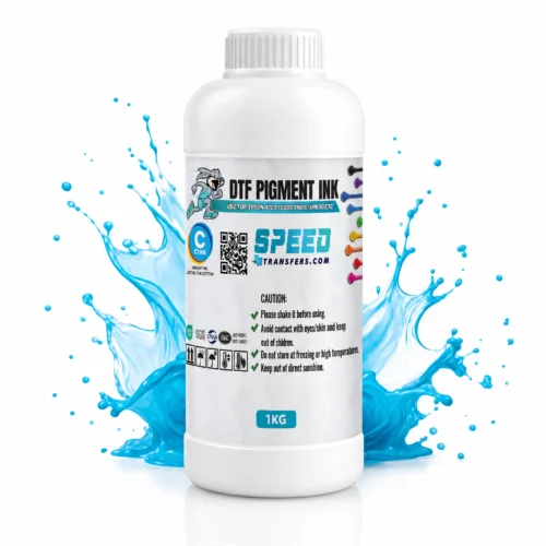
CMYK Ink
$40.00 Select options -
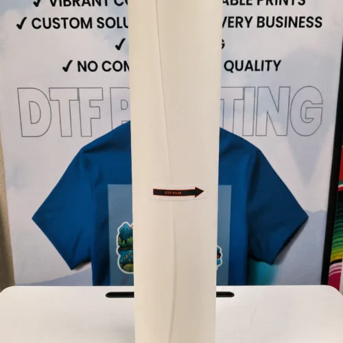
PET (DTF) Film
$200.00 Select options
Reviews
There are no reviews yet.